NYC Department of Finance
NYC Department of Finance website renewal
A responsive website design for the NYC Department of Finance focused on usability and accessibility. The work covered a 507-page sitemap reorganization and a redesign of the homepage and eight main navigation pages.
The NYC Department of Finance website is a public service platform used by millions. Its content-oriented, multi-layered structure and text-heavy pages made it hard for residents to find the information and transactions they needed. I led the homepage design, restructured a 507-page sitemap, designed eight main navigation pages, and shaped the responsive web and mobile experience.
The legacy site made information discovery difficult because of its content-heavy structure and excessive text, and mobile users also lost important information. In reality, many users landed directly on specific pages from search engines instead of the homepage, which made key notices and services easy to miss.
- —Designed for a large-scale public service with 4.1M monthly pageviews and 710K MAU
- —Addressed information overload, accessibility, and mobile content loss
- —Proposed five page templates for a more consistent experience
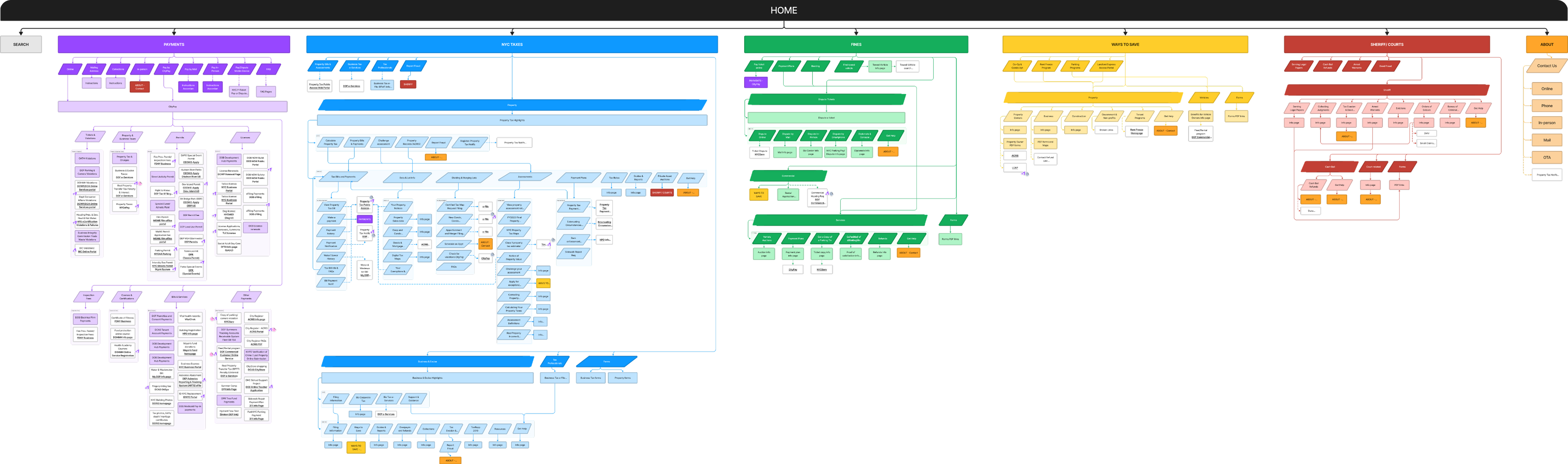
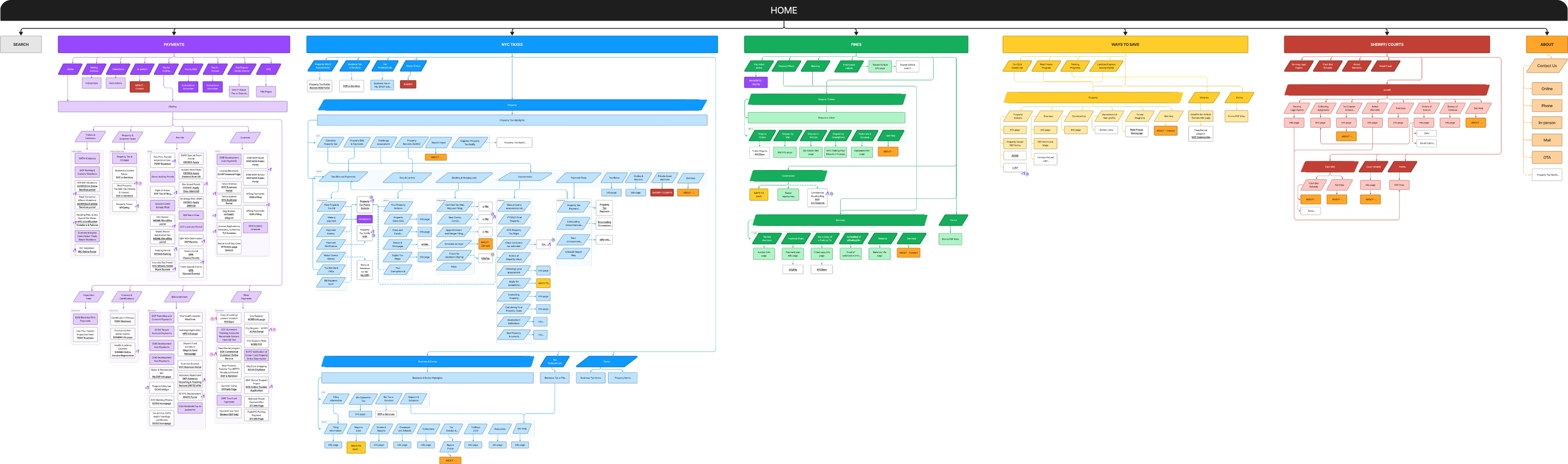
Mapped the full 507-page site to plan the new information architecture.
Led homepage design and development
Restructured a 507-page website sitemap
Created 8 main navigation pages
Designed responsive web and mobile
Reviewed site for optimal performance and design adherence
Evaluate user experience and interface effectiveness
How might we improve the DOF website to make information and transactions findable to alleviate the work for New Yorkers.
The New York City Department of Finance plays a vital role in supporting essential services for its 8.77 million residents. It engages a significant online user base, with 4.1 million monthly page views and 710,000 active monthly users, indicating a high level of public interaction and reliance on its digital services for various financial and administrative needs. This substantial online engagement underscores the department's importance in the daily financial operations of the city.
- —No verification or status updates
- —Unclear next steps
- —Questions unanswered
- —User missed urgent information
- —User was not notified of deadline
- —Desired task results in error message
- —User requests phone option due to technical difficulty
- —Login difficulty recurring payment issue
- —Make services more findable
- —Improve flow of services based on user behavior
- —Prioritize most used services
- —Too much reading is required rather than visual cues
- —Lack of responsive mobile interface
- —Clarify information hierarchy within a page
- —Making existing information accessible with plain language
10 clicks for 1 information.
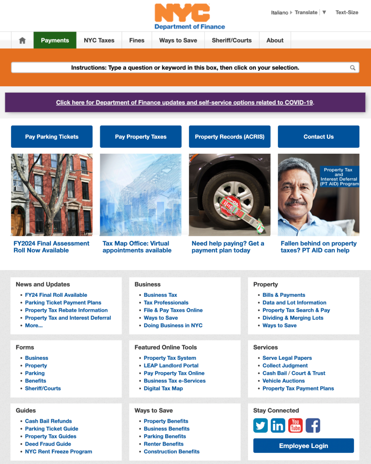
The current navigation structure of the Department of Finance's website is more content-oriented with multiple layers, as opposed to being action-oriented and streamlined. This complexity often necessitates users to click more than 10 times to access the necessary information or documentation.
"I don't search from the homepage."
Our interviews and research revealed that the homepage is not the initial landing point for many users. Due to information overload and the absence of visual cues, users tend to use Google to directly navigate to the specific pages they need. This behavior indicates that crucial information, such as important dates and news, is being overlooked as it is not prominently displayed on the homepage. Additionally, the navigation bar does not align with user needs, leading to more complex site navigation without a clear purpose.
Global navigation was not reflecting the highest traffic categories. Only 1% of user traffic goes to Sheriffs and Courts.
The updates and news were not updated frequently and lacked visual prominence, making them less noticeable to users.
This section lacked clear information and a defined visual hierarchy, leaving users uncertain about which options to choose. The mix of action-oriented and content-focused options added to the confusion about what to expect in the following steps. Moreover, many online tools designed to assist users were not sufficiently emphasized, reducing their visibility and potential utility.
Losing information in mobile.
The website's lack of responsive design for mobile devices leads to issues where information is either lost or obscured on smaller screens. This results in a compromised user experience on mobile platforms.
Information overload.
Overwhelming text volume was discouraging readers from seeking specific information, potentially causing them to miss key details. Additionally, an abundance of individual links further complicates the task of efficiently finding required services.
The revised design now centers around the interests and needs of New Yorkers, featuring content curated based on their preferences. This strategy ensures that our offerings are not only pertinent but also readily accessible, enhancing user engagement and effectiveness.
The revised design significantly improved navigation, simplifying the user's journey. This makes for more efficient exploration and quick access to information. Enhanced wayfinding makes the site more intuitive, elevating the overall user experience.
The revised design made significant strides in enhancing accessibility. Although continuous improvement is needed in this area, our efforts so far have made our website more welcoming and reachable for everyone, ensuring equitable access to our information and services.
Acknowledging the growing reliance on mobile devices, the revised design focused on refining the mobile user experience. The website now has a responsive and seamless interface across different devices, addressing the varied needs of users effectively.
Only 5 clicks away.
The restructured hierarchy and navigation will streamline the original process, reducing the steps and clicks required from 10 to fewer than 5 for document processing or information retrieval.
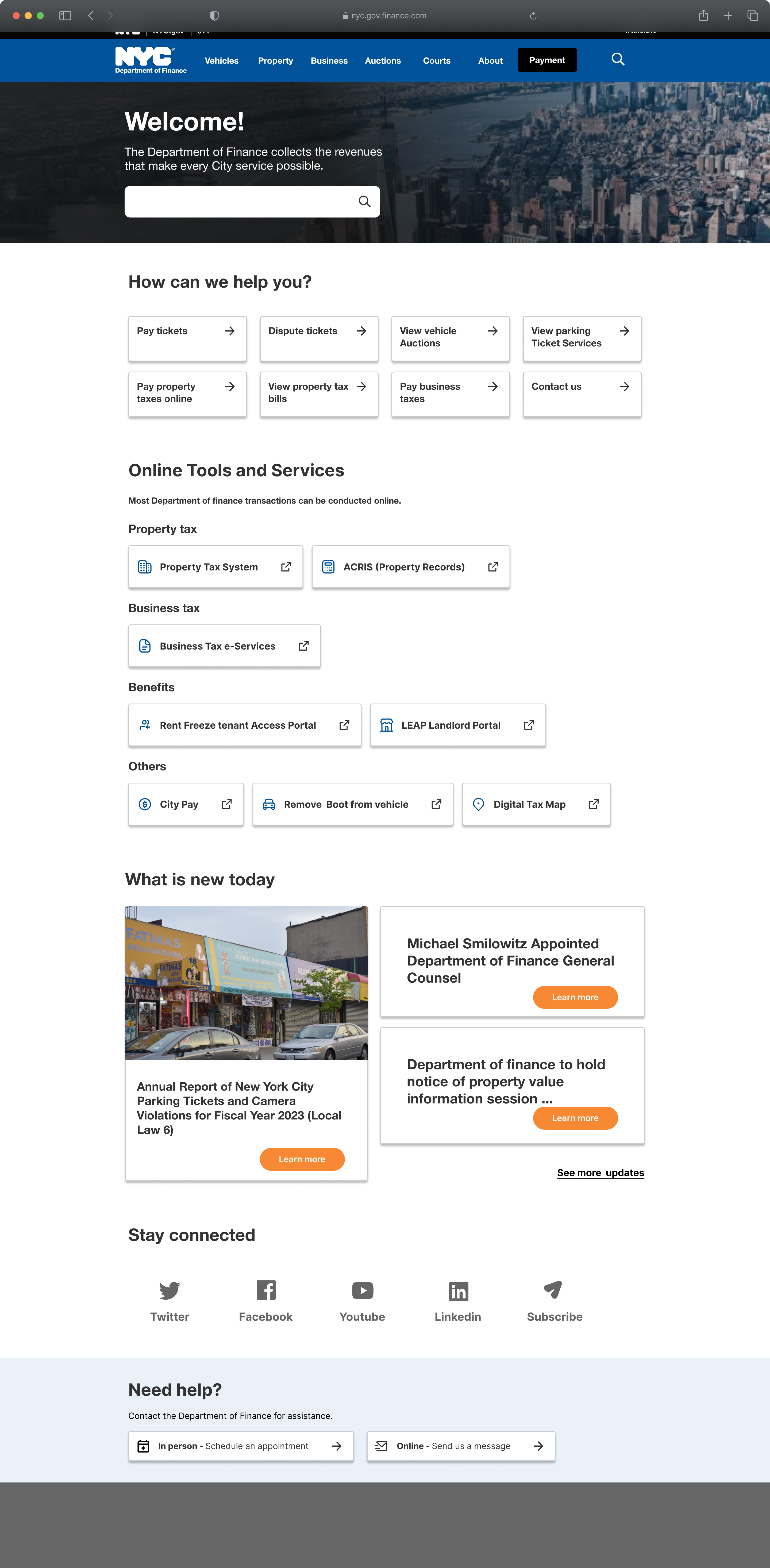
Homepage that reflects what people want.
The redesigned homepage is centered around our users' primary needs and preferences. The global navigation has been restructured, carefully categorizing content to enhance relevance within each category. Additionally, the placement of content is now guided by user engagement metrics, prioritizing the most viewed and sought-after pages. A significant focus has been placed on previously underemphasized online tools and services, aiming to improve the user experience for those interacting with the finance department's tasks.
Restructured and labeled to focus on the most essential categories, using terminology that is easily understandable for users.
Search bar has been enhanced with improved suggestions, significantly reducing the time users spend navigating through the website.
Offers the most commonly searched action-oriented pages, accompanied by buttons that provide simple visual cues for easy navigation with minimal reading required.
Provides access to external resources, enabling users to easily complete tasks or find additional, specific information required for particular tasks.
In the previous version of the site, many users were missing important news and updates due to the lack of clear and prominent notifications. In the redesigned site, we've addressed this issue to ensure that vital information is not overlooked by users.
In the redesigned site, we've ensured a visually clear and straightforward process for users who wish to connect and subscribe to updates, making it easier for them to stay informed.
Building consistent experience pattern.
With the templatized 5 archetypes for the pages, users will be able to have a patterned experience that increases usability.
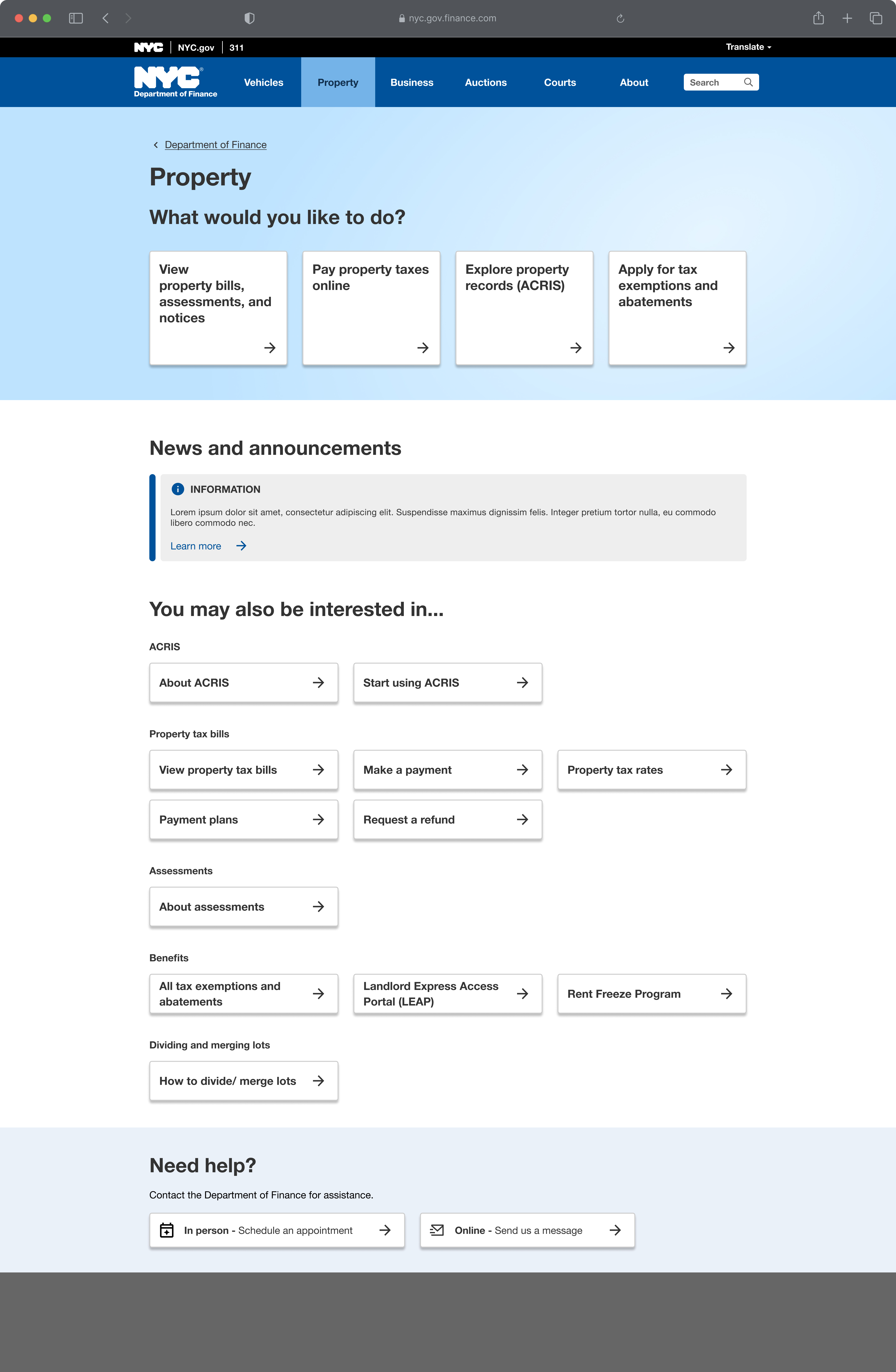
Simpler the better.
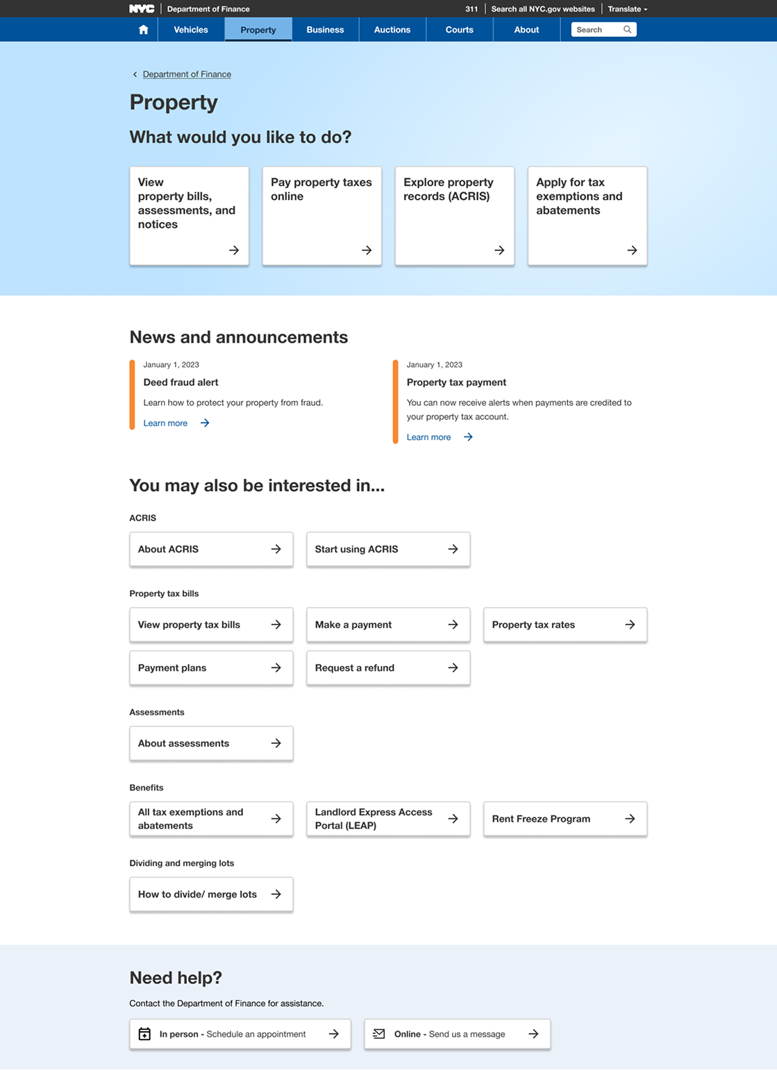
Unlike the original site, the new design features a simpler structure, focusing on the most essential information. For instance, the navigation page, where users frequently land, is organized with three main elements: prominently displayed top-viewed content, news, and other informative sections. This streamlined approach, with reduced text, enables users to find what they need more easily.
Based on user statistics, the most viewed content is strategically placed at the top of the page, eliminating the need for users to scroll down to find this information. With the breadcrumbs on the top, users will be able to see where they are located.
News and announcements relevant to the topic, designed to inform users and keep them updated on new learning opportunities or important developments to follow.
The information is presented in a button format, requiring minimal reading for users to easily navigate and access further details.
The contact section is consistently available on all pages, providing users with easy access to assistance whenever needed.
Responsive design that prevents information loss.
With the implementation of templatized and simplified design as a website, the mobile version maintains information integrity and prevents layout disruptions.
The redesign site around what New Yorkers actually come to do: five page archetypes for a consistent experience, a homepage led by real engagement data, and a path to key documents cut from more than 10 clicks to fewer than 5.
Cut a navigation path that often took more than 10 clicks and brought the most-used services to the front.